
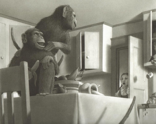
I'd never really noticed it before but Chris Van Allsburg's illustrations seem to owe something to the black-and-white illustrations of Maxfield Parrish:
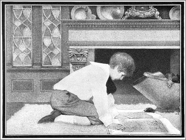
Same diffusion in the surface treatment, same bold modeling of solid forms beneath it. In terms of composition, Parrish was attracted to tableaux, which gives his images a flavor of the theater, while Van Allsburg uses more dynamic angles emphasizing spatial depth, which feels more cinematic.